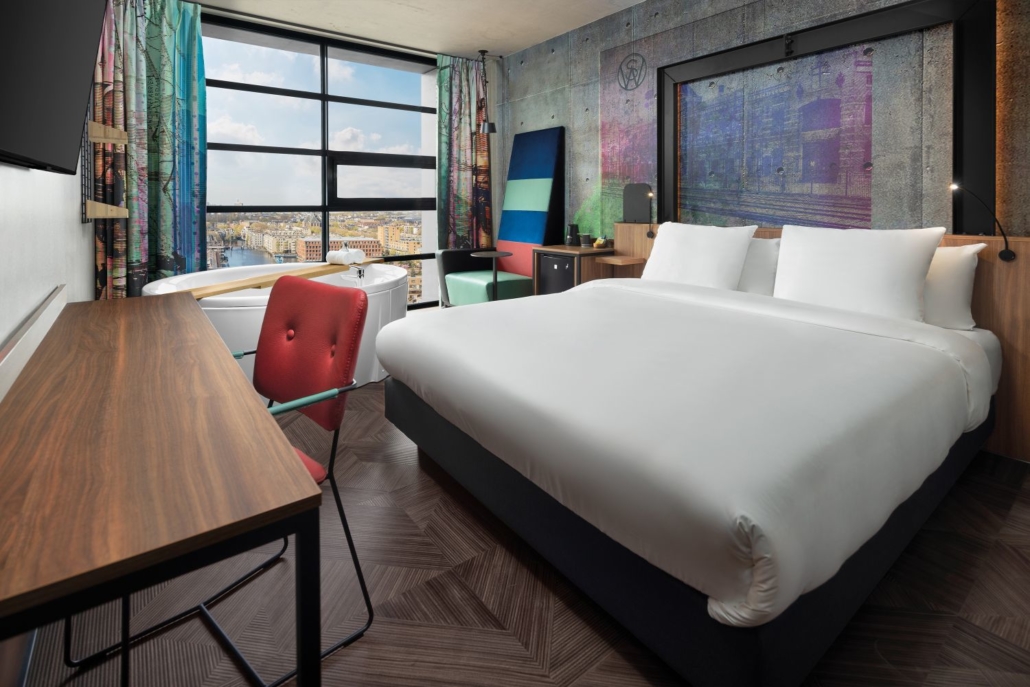
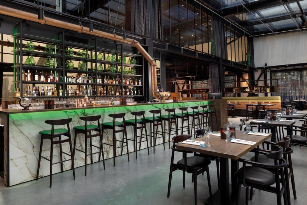
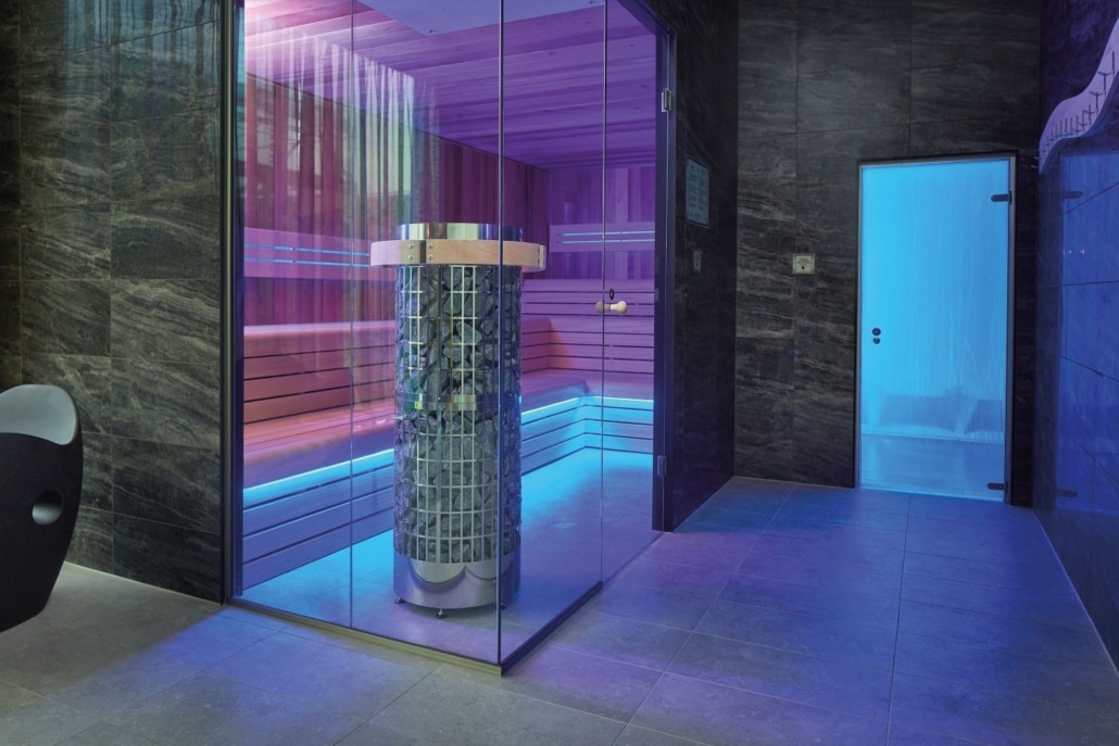
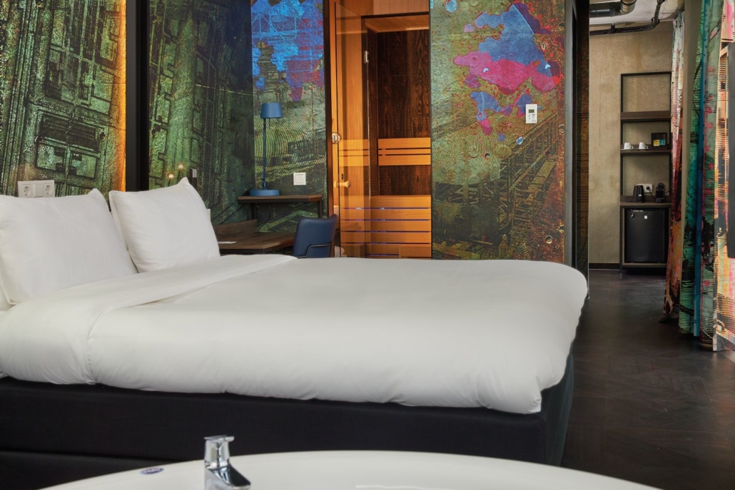
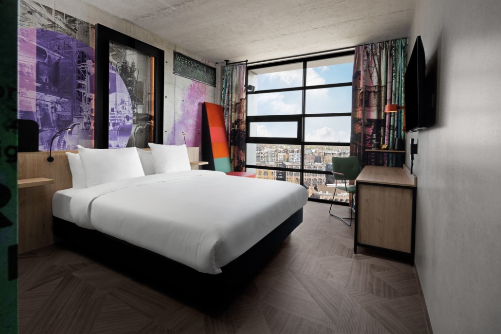
Inntel Hotels Amsterdam Landmark hat einen eigenwilligen Charakter, der von der industriellen Vergangenheit der Region inspiriert ist. Hier können Sie übernachten, abends in der Bar & Brasserie Werkspoor speisen, geschäftliche Veranstaltungen organisieren und sich im Spa Steam entspannen. Das Wellnesszentrum verfügt über einen Pool, ein Türkisches Bad, eine Sauna und einen Massageraum. Darüber hinaus sind alle Luxus-Zimmertypen mit einem runden bubble bath im Zimmer und/oder einer eigenen Sauna ausgestattet. So können Sie sich in den trendigen und luxuriösen Zimmern mit herrlichem Blick auf die Skyline von Amsterdam entspannen.
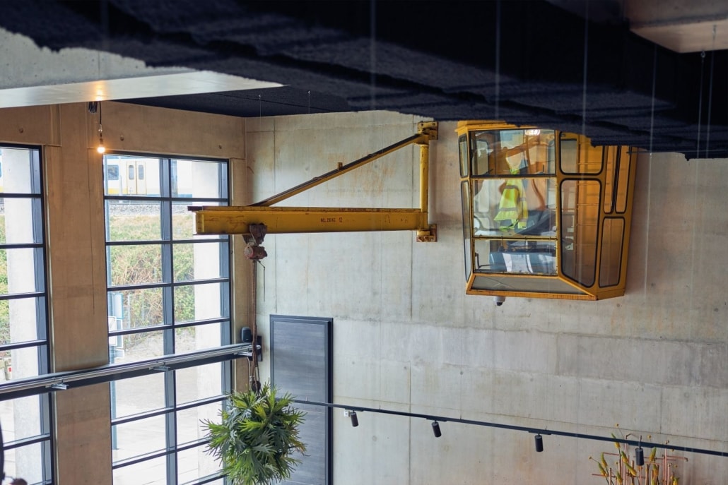
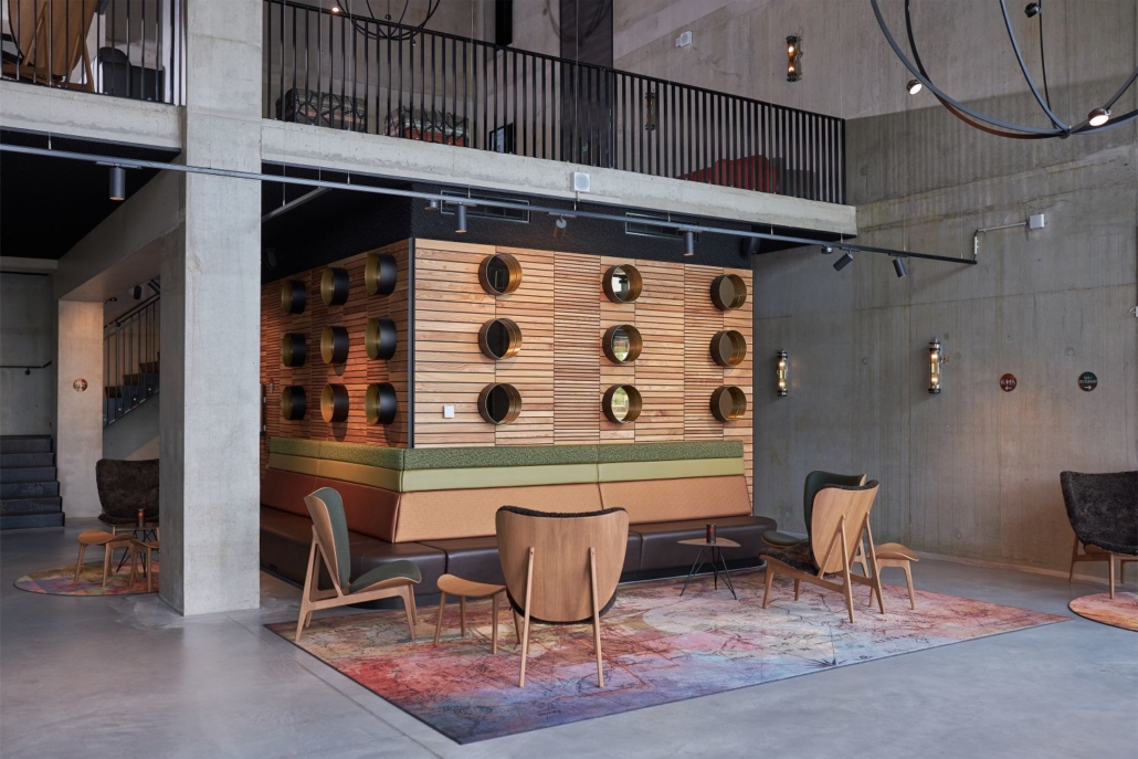
Industrielle Handwerkskunst spiegelt sich im Design des 16-stöckigen Hotels wider. Rohbeton, massive Metallsäulen und sogar ein lebensgroßes gelbes Kranhaus machen dieses Hotel zum originellsten Hotel von Inntel Hotels. Die industriellen Elemente passen sowohl zur Geschichte als auch zur Zukunft des beliebten Stadtteils Oostenburg. In den Zimmern wird das Thema dank maßgeschneiderter Innenausstattung bis ins kleinste Detail umgesetzt.
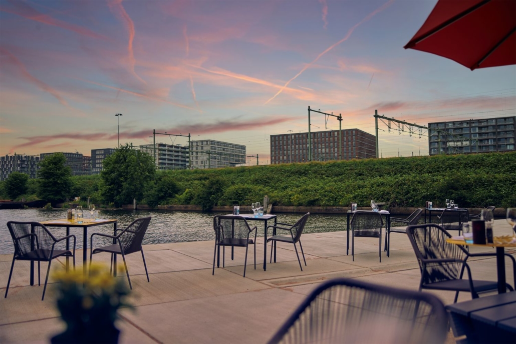
Die Lage in Oostenburg bietet Ihnen eine Kombination aus dem lebendigen Zentrum von Amsterdam und der entspannten industriellen Atmosphäre von Amsterdam Oost. Der künstlerische Charakter von Oostenburg macht diese Umgebung zum „kleinen Berlin“ unserer Hauptstadt.
Alle Höhepunkte von Amsterdam sind vom Hotel aus leicht erreichbar. In nur 5 Minuten zu Fuß erreichen Sie die Straßenbahnhaltestelle Rietlandpark. Von dieser Haltestelle aus sind Sie mit der Straßenbahnlinie 26 innerhalb weniger Minuten am Hauptbahnhof von Amsterdam! Über die Straßenbahnhaltestelle Eerste Leegwaterstraat gelangen Sie bequem mit der Straßenbahnlinie 7 zum Zoo Artis, zum Rijksmuseum und zum Leidseplein. Möchten Sie die Stadt lieber mit dem Fahrrad erkunden? Das Inntel Hotels Amsterdam Landmark bietet einen Fahrradverleih für seine Gäste an. Entdecken Sie Amsterdam auf typisch niederländische Weise!
Inntel Hotels respektiert den Menschen und die Umwelt und möchte zu einem gesunden Planeten und einer guten Gesellschaft beitragen. Mit dem Programm Surprisingly Sustainable arbeiten wir an einer nachhaltigen Zukunft.
")


